Responsive
The website has a breakpoint behavior that defines different representations for different output media. This means that, depending on the device, the layout of the website is optimized (responsive).
-
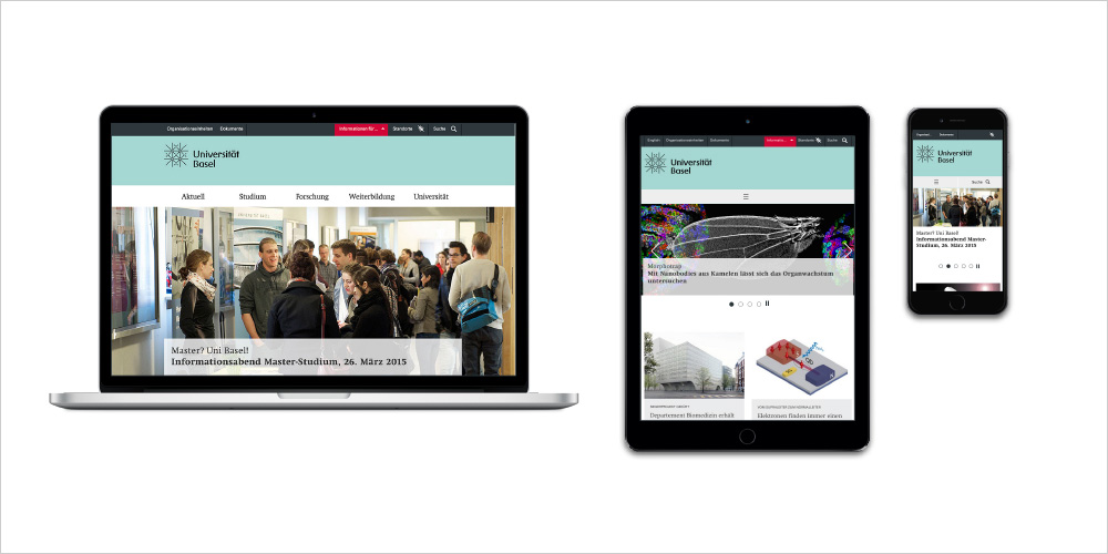 Responsive behaviour - Online CD University of Basellink.zoom
Breakpoints
Device
Breakpoint
Device
Desktop
Breakpoint
> 768
Device
Tablet
Breakpoint
> 768
Device
Smartphone
Breakpoint
> 400